> ## Documentation Index
> Fetch the complete documentation index at: https://docs.getprova.com/llms.txt
> Use this file to discover all available pages before exploring further.
# Home Dashboard
> Learn how to read the Provalytics home dashboard.
## Overview
The Home Dashboard is the main landing page for a client account. It summarizes incremental marketing performance for the selected date range.
Use it to understand:
* Total incremental contribution
* Channel contribution
* Channel efficiency
* Performance trends
* Model validation
* Recommended next action
## What the dashboard shows
The dashboard combines the most important summary views in one place:
* KPI, date range, and grain selectors at the top
* summary cards for impressions, clicks, spend, and the selected KPI
* a daily trend chart
* an incrementality mix view
* a spend mix view
* a channel incrementality table
* a validation summary
* a recommendations card when optimization outputs are available
## How to use it
Start with the KPI, date range, and grain. Then review the summary cards, trend, channel mix, validation, and recommendations in that order.
## Reading the top of the page
The top section sets the frame for everything else on the dashboard.
Use it to:
* choose the KPI you want to evaluate
* set the date range for the analysis
* switch the reporting grain
* review headline totals before drilling deeper
The summary cards give a fast read on scale and efficiency for the selected KPI window.
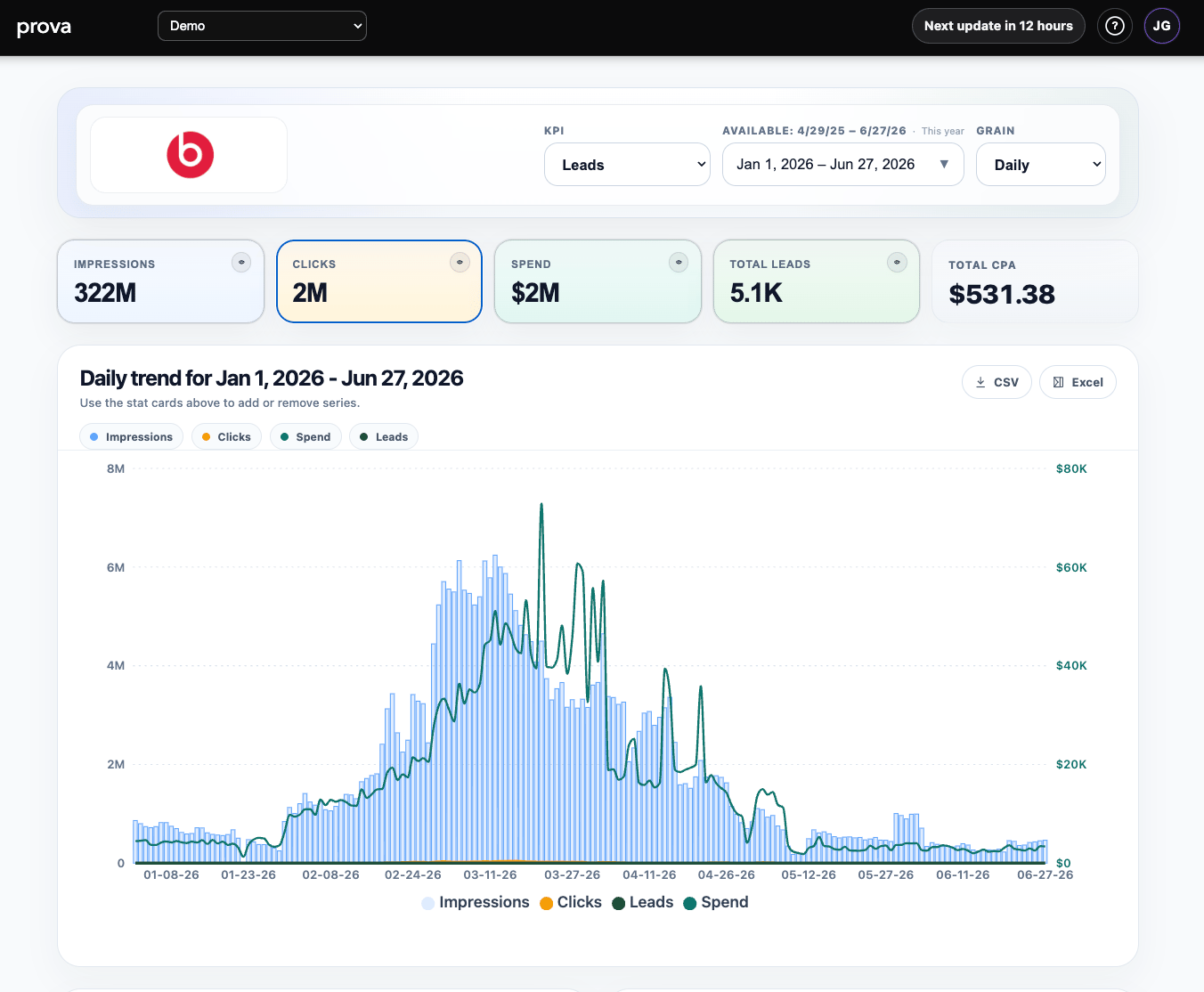 ## Reading the trend and mix views
The trend chart shows how performance changed over time for the selected KPI and selected supporting series.
Use it to spot:
* demand spikes
* pacing changes
* efficiency shifts
* periods that deserve deeper investigation in other reports
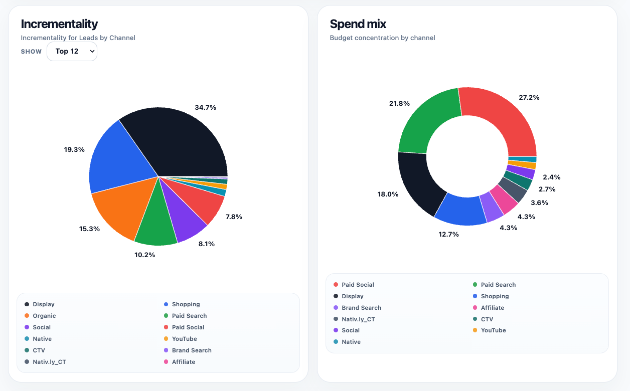
The incrementality and spend-mix charts help you compare business impact against budget concentration. Together, they help answer whether a channel is contributing its fair share relative to what it is consuming.
## Reading the trend and mix views
The trend chart shows how performance changed over time for the selected KPI and selected supporting series.
Use it to spot:
* demand spikes
* pacing changes
* efficiency shifts
* periods that deserve deeper investigation in other reports
The incrementality and spend-mix charts help you compare business impact against budget concentration. Together, they help answer whether a channel is contributing its fair share relative to what it is consuming.
 ## Reading the channel table and lower cards
The channel incrementality table is where the dashboard becomes operational.
Use it to compare:
* contribution
* share
* cost
* efficiency
The lower cards then add two important checks:
* `Prediction vs. Actual` gives a fast validation signal
* `Budget reallocation available` points toward the next planning action when optimization outputs exist
## Reading the channel table and lower cards
The channel incrementality table is where the dashboard becomes operational.
Use it to compare:
* contribution
* share
* cost
* efficiency
The lower cards then add two important checks:
* `Prediction vs. Actual` gives a fast validation signal
* `Budget reallocation available` points toward the next planning action when optimization outputs exist
 ## How to interpret the results
Do not use the dashboard as a simple ranking table.
A channel with high efficiency but low contribution may be too small to matter much at the business level. A channel with lower direct efficiency may still be important if it creates halo effects, supports the rest of the funnel, or contributes meaningful total volume.
The dashboard is best used as a decision-orientation view. It tells you where to look next, not just what to celebrate or cut.
## Where to go next
* [Incrementality Report](/using-provalytics/incrementality-report)
* [Campaign Performance](/using-provalytics/campaign-performance)
* [Proof Report](/using-provalytics/proof-report)
* [Budget Recommendations](/planning/budget-recommendations)
## How to interpret the results
Do not use the dashboard as a simple ranking table.
A channel with high efficiency but low contribution may be too small to matter much at the business level. A channel with lower direct efficiency may still be important if it creates halo effects, supports the rest of the funnel, or contributes meaningful total volume.
The dashboard is best used as a decision-orientation view. It tells you where to look next, not just what to celebrate or cut.
## Where to go next
* [Incrementality Report](/using-provalytics/incrementality-report)
* [Campaign Performance](/using-provalytics/campaign-performance)
* [Proof Report](/using-provalytics/proof-report)
* [Budget Recommendations](/planning/budget-recommendations)