Overview
Trending is the time-segmented reporting view in Provalytics. It is designed to help you see how channel performance changes across time, not just where a channel finished in a single reporting window. This makes it especially useful for:- pacing analysis
- week-over-week or month-over-month comparisons
- diagnosing shifts in efficiency
- comparing contribution alongside supporting metrics like clicks, impressions, and CPM
What the page does
Trending combines:- KPI and date controls
- optional time segmentation
- optional chart visualization
- expandable channel rows
- optional metric columns such as clicks, impressions, and CPM
- a table-led reporting view
- a chart-led trend-inspection view
Step 1: Start with the default trend table
The default view gives you a clean summary table by channel for the selected KPI and date range. This is the best place to start when you want the core trend-ready metrics without extra segmentation.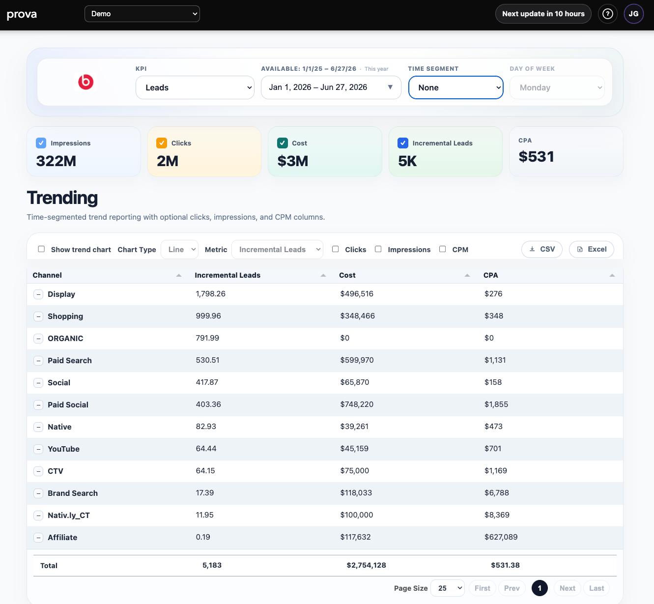
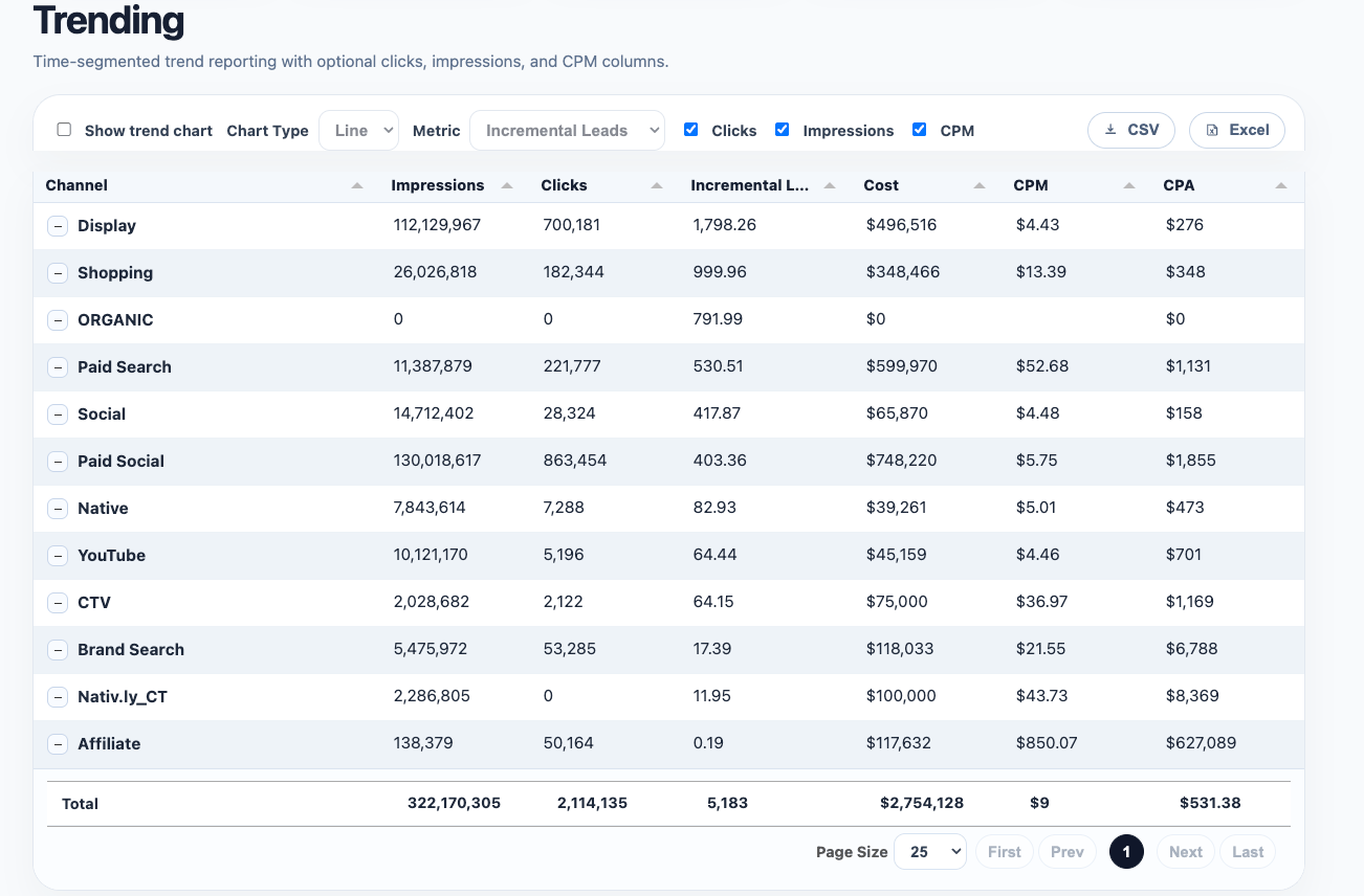
Step 2: Add supporting metrics
Trending becomes much more useful when you turn on optional columns such as:- clicks
- impressions
- CPM
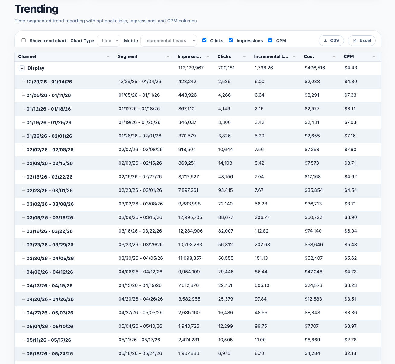
Step 3: Use time segmentation for comparison
TheTime Segment control lets you break a channel into comparable periods, such as weekly segments.
This is one of the most useful features on the page because it turns a channel total into a sequence of comparable windows.
That makes it easier to answer:
- what changed week over week?
- when did a spike start?
- did a shift happen gradually or all at once?
- did supporting metrics move with the KPI?
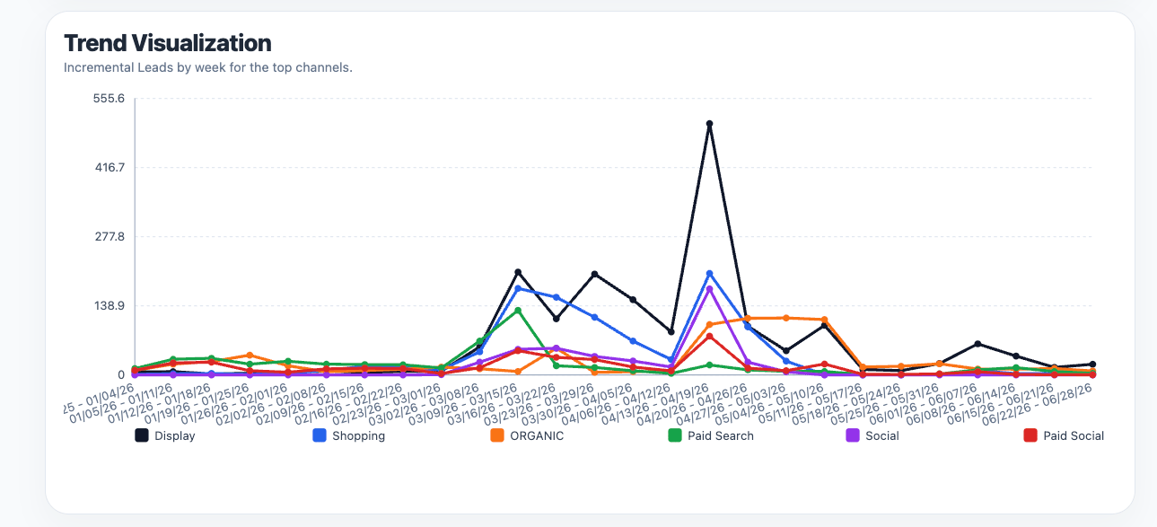
Step 4: Turn on the trend chart
When you enableShow trend chart, Trending switches from a table-only reporting view into a visual comparison view.
This is especially useful when you want to compare:
- multiple channels at once
- one metric across time
- inflection points and spikes
- whether channels are moving together or diverging
How to use Trending well
Use Trending when you want to answer questions like:- Is performance improving or fading over time?
- Did a budget change produce a visible shift?
- Are efficiency metrics moving with the KPI or against it?
- Which weeks or months deserve a deeper investigation?
- where the result stands
- how it changed
- and when the next timing move might matter
A practical reading rule
Do not react to every line movement in isolation. Use Trending to identify:- meaningful direction changes
- repeated patterns
- timing mismatches
- metric combinations that explain a shift